Why Some Artists Avoid Black & White in Watercolors?

Why Some Artists Avoid Black in Watercolors:
1. It Flattens the Painting
Black can make areas look dull or lifeless because it lacks the color complexity you get from mixing your own darks.
2. It Muddies Other Colors
When you mix black with bright colors, the result can look muddy or “dirty” instead of vibrant.
3. You Can Mix Better Darks
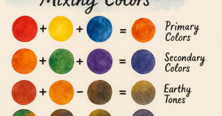
Experienced artists often mix deep colors using complementary colors (like blue + orange or red + green) to create rich, glowing shadows that still feel colorful.
4. Payne’s Gray Is a Better Option
Many artists use Payne’s Gray, a bluish-gray alternative, for dark areas. It’s softer and blends better with other watercolor tones.
Why Some Artists Avoid White in Watercolors:
1. Watercolor Is Transparent by Nature
Watercolor shines because of its luminosity—light reflects through transparent layers of paint and bounces off the white paper underneath.
2. White Paint Looks Chalky
When you add white paint, it sits on top of the paper and makes colors look opaque and flat, which defeats the natural glow of watercolor.
3. Highlights Should Come from the Paper
Skilled watercolorists plan ahead and leave white areas unpainted to create highlights. It takes practice, but it keeps your painting fresh and light-filled.
When It’s Okay to Use Black or White
You're a beginner and still learning
You’re working in mixed media
You want a bold, graphic style
You're painting on colored or toned paper
You're combining watercolor with gouache
ព័ត៌មានថ្មីៗ